I have had a busy few days at work without much time to keep up with reading feeds, so I’m sitting here catching up on the feeds that have built up during the week. I saw Jeff Revell’s mention that the gallery for the walk he led was up on the official page so I went to check the page of the walk I took part in.
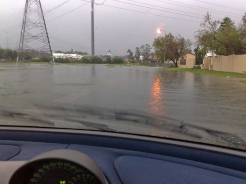
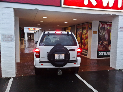
Sure enough the photos were up and I scanned the thumbnails to see what was there and check that my submissions had made it. It was only when I reached my own images, the last two, that I thought “Hey, one of those images doesn’t look right.” It took me a moment to realise what the cause was; the thumbnail was square and my images have the standard DSLR 3:2 aspect ratio. As the images below show, one of them is a minimalist photo that doesn’t lose much when cropped to a square, but the other one loses a lot.

In the case of the photo walk galleries, these are not clickable thumbnails but I have seen other sites do this and it concerns me that sites would use thumbnails that crop significant information from photographs. With all the millions of photographs out there that a potential audience might view, it’s vital that the first impression grabs the viewer’s attention to draw all possible viewers to your photograph.
So site developers, don’t be square and crop your member’s thumbnails; and photographers, think twice about signing up to and posting your photos to sites that are going to unfavourably crop your images.


